Navbar Vertical
Here is the available built-in option of Falcon's powerful, responsive vertical navigation. The following sections describe how you can customize both the responsive breakpoint and collapsing behavior.
Responsive behavior
Falcon used the Bootstrap's .navbar-expand{-sm|-md|-lg|-xl|-xxl} classes in .navbar-vertical element to decide when the navbar vertical will expand or not.
<nav class="navbar navbar-vertical navbar-expand-xl navbar-light">

  <!-- Content-->
  <div class="collapse navbar-collapse">
    <div class="navbar-vertical-content scrollbar">

      <!-- Collapsible content-->
    </div>
  </div>
</nav>
Collapsing behavior
You can control the default collapsing behavior of Falcon's vertical navigation - whether it will show up with the collapsed or expanded state when the page loads.
From your project directory, If you are using gulp version open src/js/config.js or if you are using directly from the public folder open public/assets/js/theme.js and set isNavbarVerticalCollapsed: true of CONFIG object
to collapse the Vertical Navigation by default
const CONFIG = {
  isNavbarVerticalCollapsed: false,
  ...
};
Link
Normally, links in navbar vertical may contain icons, texts, badges and indicator icons. By default each elements in navbar vertical's links are vertically centered with each other. Navbar vertical's top parent link example:
<a class="nav-link" href="#">
  <div class="d-flex align-items-center">
    <span class="nav-link-icon"><span class="fas fa-chart-pie"></span></span>
    <span class="nav-link-text">Dashboard </span>
    <span class="badge rounded-pill badge-subtle-success ms-2">New</span>
  </div>
</a>
If you have long texts or you want to update the alignment, you can customize by removing align-items-center class or adding Bootstrap align-items-* helper classes.
Child link example:
<a class="nav-link" href="#">
  <div class="d-flex align-items-center">
    Dashboard
    <span class="badge rounded-pill badge-subtle-success ms-2">New</span>
  </div>
</a>
Add dropdown-indicator class to .nav-link element to show arrow icon to the right side of the link text.
<a class="nav-link dropdown-indicator" href="#">

  <!-- link content-->
</a>
Event
Falcon navbar vertical exposes navbar.vertical.toggle event for hooking into navbar vertical collapse functionality. The event fire immediately after .navbar-vertical-toggle element is clicked.
const navbarVerticalToggle = document.querySelector(.navbar-vertical-toggle);
navbarVerticalToggle.addEventListener('navbar.vertical.toggle', function () {
  // do something...
})
Customize
You can easily customize Falcon's Navbar Vertical style using SCSS variables. All available variables are listed below:
Breakpoints
Falcon use $grid-brekpoints in reversed order for styling navbar vertical when screen size is above the breakpoint. Note: Falcon get the brekpoint from .navbar-expand-* class.
$navbar-vertical-breakpoints: mapReverse($grid-breakpoints) !default;Width
It's possible to update navbar vertical default width when screen size is above breakpoint.
$navbar-vertical-width: 12.625rem !default;Icon Width
Set navbar vertical icon width and height using the variable.
$navbar-vertical-icon-width: 1.5rem !default;Collapsed width
Update width of navbar vertical when it is collapsed.
$navbar-vertical-collapsed-width: 3.125rem !default;Hover Width
To change the navbar vertical width on mouse over update the variable.
$navbar-vertical-hover-width: 12.875rem !default;Hover shadow
Update navbar vertical shadow on mouse over
$navbar-vertical-collapsed-hover-shadow: 0.625rem 0 0.625rem -0.5625rem rgba($black, 0.2) !default;Variation Width
Falcon comes with different types of navbar vertical and you can change the width of those navbar by updating the variable.
$navbar-vertical-variation-width: 14.5rem !default;Variation collapsed width
To change the collapsed with of navbar vertical variation update the variable.
$navbar-vertical-variation-collapsed-width: 4.125rem !default;Font size
To change the font size of navbar vertical link update the variable.
$navbar-vertical-link-font-size: $font-size-sm !default;Dropdown font size
To change the dropdown font size of navbar vertical link update the variable.
$navbar-vertical-dropdown-font-size: 0.8125rem !default;Navbar Styles
You can change the look of your Navbar Vertical in different styles. You can also customize your navbar vertical using SCSS variables. The different navbar styles are listed below:
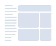
Navbar Vertical Default
Falcon lets you choose your own custom colors and customize Default Navbar Vertical.
See the implementation hereHtml
Class .navbar-vertical represents the default Transparent Vertical Navbar.
<nav class="navbar navbar-vertical navbar-expand-xl navbar-light">

  <!-- Content-->
  <div class="collapse navbar-collapse">
    <div class="navbar-vertical-content scrollbar">

      <!-- Navbar content-->
    </div>
  </div>
</nav>
You can change background-color by adding .bg-* utility classes in .navbar-collapse element or you can update globally using the SCSS or CSS variable which is described in Customize section below.
<div class="collapse navbar-collapse bg-1000">
   <div class="navbar-vertical-content scrollbar">

     <!-- Navbar content-->
   </div>
 </div>
Customize
Falcon allow you to customize your Navbar Vertical with SCSS or CSS variables. The available options are listed below:
Background color
To change the background color
of the
Navbar Vertical
, update the SCSS variable $navbar-vertical-default-bg-color in your _user-variables.scss or CSS variable --falcon-navbar-vertical-default-bg-color in your public/assets/css/user.css. Example:
//- _user-variables.scss
$navbar-vertical-default-bg-color: #ff0000;
or,
//- public/assets/css/user.css
--falcon-navbar-vertical-default-bg-color: #ff0000;
Link color
To change the link color
of the
Navbar Vertical
, update the SCSS variable $navbar-vertical-default-link-color in your _user-variables.scss or CSS variable --falcon-navbar-vertical-default-link-color in your public/assets/css/user.css. Example:
//- _user-variables.scss
$navbar-vertical-default-link-color: #ff0000;
or,
//- public/assets/css/user.css
--falcon-navbar-vertical-default-link-color: #ff0000;
Link hover color
To change the link hover color
of the
Navbar Vertical
, update the SCSS variable $navbar-vertical-default-link-hover-color in your _user-variables.scss or CSS variable --falcon-navbar-vertical-default-link-hover-color in your public/assets/css/user.css. Example:
//- _user-variables.scss
$navbar-vertical-default-link-hover-color: #ff0000;
or,
//- public/assets/css/user.css
--falcon-navbar-vertical-default-link-hover-color: #ff0000;
Link active color
To change the link active color
of the
Navbar Vertical
, update the SCSS variable $navbar-vertical-default-link-active-color in your _user-variables.scss or CSS variable --falcon-navbar-vertical-default-link-active-color in your public/assets/css/user.css. Example:
//- _user-variables.scss
$navbar-vertical-default-link-active-color: #ff0000;
or,
//- public/assets/css/user.css
--falcon-navbar-vertical-default-link-active-color: #ff0000;
Divider color
To change the divider color
of the
Navbar Vertical
, update the SCSS variable $navbar-vertical-default-hr-color in your _user-variables.scss or CSS variable --falcon-navbar-vertical-default-hr-color in your public/assets/css/user.css. Example:
//- _user-variables.scss
$navbar-vertical-default-hr-color: #ff0000;
or,
//- public/assets/css/user.css
--falcon-navbar-vertical-default-hr-color: #ff0000;
Scrollbar color
To change the scrollbar color
of the
Navbar Vertical
, update the SCSS variable $navbar-vertical-default-scrollbar-color in your _user-variables.scss or CSS variable --falcon-navbar-vertical-default-scrollbar-color in your public/assets/css/user.css. Example:
//- _user-variables.scss
$navbar-vertical-default-scrollbar-color: #ff0000;
or,
//- public/assets/css/user.css
--falcon-navbar-vertical-default-scrollbar-color: #ff0000;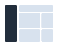
Navbar Vertical Inverted
You can update your Navbar Vertical background-color with Navbar Vertical Inverted.
Html
Add .navbar-inverted class to .navbar-vertical element to convert Transparent Vertical Navbar to Inverted Vertical Navbar.
<nav class="navbar navbar-vertical navbar-expand-xl navbar-light navbar-inverted">

  <!-- Content-->
  <div class="collapse navbar-collapse">
    <div class="navbar-vertical-content scrollbar">

      <!-- Navbar content-->
    </div>
  </div>
</nav>
You can change background-color by adding .bg-* utility classes in .navbar-collapse element or you can update globally using the SCSS variable which is described in SCSS section below.
<div class="collapse navbar-collapse bg-1000">
   <div class="navbar-vertical-content scrollbar">

     <!-- Navbar content-->
   </div>
 </div>
Customize
Falcon allow you to customize your Navbar Vertical with SCSS or CSS variables. The available options are listed below:
Background color
To change the background color
of the
Navbar Vertical Inverted
, update the SCSS variable $navbar-vertical-inverted-bg-color in your _user-variables.scss or CSS variable --falcon-navbar-vertical-inverted-bg-color in your public/assets/css/user.css. Example:
//- _user-variables.scss
$navbar-vertical-inverted-bg-color: #ff0000;
or,
//- public/assets/css/user.css
--falcon-navbar-vertical-inverted-bg-color: #ff0000;
Link color
To change the link color
of the
Navbar Vertical Inverted
, update the SCSS variable $navbar-vertical-inverted-link-color in your _user-variables.scss or CSS variable --falcon-navbar-vertical-inverted-link-color in your public/assets/css/user.css. Example:
//- _user-variables.scss
$navbar-vertical-inverted-link-color: #ff0000;
or,
//- public/assets/css/user.css
--falcon-navbar-vertical-inverted-link-color: #ff0000;
Link hover color
To change the link hover color
of the
Navbar Vertical Inverted
, update the SCSS variable $navbar-vertical-inverted-link-hover-color in your _user-variables.scss or CSS variable --falcon-navbar-vertical-inverted-link-hover-color in your public/assets/css/user.css. Example:
//- _user-variables.scss
$navbar-vertical-inverted-link-hover-color: #ff0000;
or,
//- public/assets/css/user.css
--falcon-navbar-vertical-inverted-link-hover-color: #ff0000;
Link active color
To change the link active color
of the
Navbar Vertical Inverted
, update the SCSS variable $navbar-vertical-inverted-link-active-color in your _user-variables.scss or CSS variable --falcon-navbar-vertical-inverted-link-active-color in your public/assets/css/user.css. Example:
//- _user-variables.scss
$navbar-vertical-inverted-link-active-color: #ff0000;
or,
//- public/assets/css/user.css
--falcon-navbar-vertical-inverted-link-active-color: #ff0000;
Divider color
To change the divider color
of the
Navbar Vertical Inverted
, update the SCSS variable $navbar-vertical-inverted-hr-color in your _user-variables.scss or CSS variable --falcon-navbar-vertical-inverted-hr-color in your public/assets/css/user.css. Example:
//- _user-variables.scss
$navbar-vertical-inverted-hr-color: #ff0000;
or,
//- public/assets/css/user.css
--falcon-navbar-vertical-inverted-hr-color: #ff0000;
Scrollbar color
To change the scrollbar color
of the
Navbar Vertical Inverted
, update the SCSS variable $navbar-vertical-inverted-scrollbar-color in your _user-variables.scss or CSS variable --falcon-navbar-vertical-inverted-scrollbar-color in your public/assets/css/user.css. Example:
//- _user-variables.scss
$navbar-vertical-inverted-scrollbar-color: #ff0000;
or,
//- public/assets/css/user.css
--falcon-navbar-vertical-inverted-scrollbar-color: #ff0000;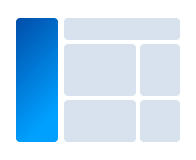
Navbar Vertical Vibrant
Make your Navbar Vertical more live and awesome with Falcon Navbar Vibrant.
See the implementation hereHtml
Add .navbar-vibrant class to .navbar-vertical element which will set a gradient-color and a background-image to the .navbar-collapse element. This style come from theme.css.
<nav class="navbar navbar-vertical navbar-expand-xl navbar-light navbar-vibrant">

  <!-- Content-->
  <div class="collapse navbar-collapse">
    <div class="navbar-vertical-content scrollbar">

      <!-- Navbar content-->
    </div>
  </div>
</nav>
You can change the background of navbar vibrant using inline style. Add style attribute to .navbar-collapse element to change the backgruond image property. Otherwise, you can change background using SCSS variable.
<div class="collapse navbar-collapse" style="background-image: linear-gradient(-45deg, rgba(0, 160, 255, 0.86), #0048a2), url(assets/img/generic/bg-navbar.png)">
  <div class="navbar-vertical-content scrollbar">

    <!-- Navbar content-->
  </div>
</div>
Customize
Falcon allow you to customize your Navbar Vertical with SCSS or CSS variables. The available options are listed below:
Background
To change the background
of the
Navbar Vertical Vibrant
, update the SCSS variable $navbar-vertical-vibrant-bg-image in your _user-variables.scss or CSS variable --falcon-navbar-vertical-vibrant-bg-image in your public/assets/css/user.css. Example:
//- _user-variables.scss
$navbar-vertical-vibrant-bg-image: linear-gradient(-45deg,rgba(0, 160, 255, 0.86),#0048a2);
or,
//- public/assets/css/user.css
--falcon-navbar-vertical-vibrant-bg-image: linear-gradient(-45deg,rgba(0, 160, 255, 0.86),#0048a2);
Link color
To change the link color
of the
Navbar Vertical Vibrant
, update the SCSS variable $navbar-vertical-vibrant-link-color in your _user-variables.scss or CSS variable --falcon-navbar-vertical-vibrant-link-color in your public/assets/css/user.css. Example:
//- _user-variables.scss
$navbar-vertical-vibrant-link-color: #ff0000;
or,
//- public/assets/css/user.css
--falcon-navbar-vertical-vibrant-link-color: #ff0000;
Link hover color
To change the link hover color
of the
Navbar Vertical Vibrant
, update the SCSS variable $navbar-vertical-vibrant-link-hover-color in your _user-variables.scss or CSS variable --falcon-navbar-vertical-vibrant-link-hover-color in your public/assets/css/user.css. Example:
//- _user-variables.scss
$navbar-vertical-vibrant-link-hover-color: #ff0000;
or,
//- public/assets/css/user.css
--falcon-navbar-vertical-vibrant-link-hover-color: #ff0000;
Link active color
To change the link active color
of the
Navbar Vertical Vibrant
, update the SCSS variable $navbar-vertical-vibrant-link-active-color in your _user-variables.scss or CSS variable --falcon-navbar-vertical-vibrant-link-active-color in your public/assets/css/user.css. Example:
//- _user-variables.scss
$navbar-vertical-vibrant-link-active-color: #ff0000;
or,
//- public/assets/css/user.css
--falcon-navbar-vertical-vibrant-link-active-color: #ff0000;
Divider color
To change the divider color
of the
Navbar Vertical Vibrant
, update the SCSS variable $navbar-vertical-vibrant-hr-color in your _user-variables.scss or CSS variable --falcon-navbar-vertical-vibrant-hr-color in your public/assets/css/user.css. Example:
//- _user-variables.scss
$navbar-vertical-vibrant-hr-color: #ff0000;
or,
//- public/assets/css/user.css
--falcon-navbar-vertical-vibrant-hr-color: #ff0000;
Scrollbar color
To change the scrollbar color
of the
Navbar Vertical Vibrant
, update the SCSS variable $navbar-vertical-vibrant-scrollbar-color in your _user-variables.scss or CSS variable --falcon-navbar-vertical-vibrant-scrollbar-color in your public/assets/css/user.css. Example:
//- _user-variables.scss
$navbar-vertical-vibrant-scrollbar-color: #ff0000;
or,
//- public/assets/css/user.css
--falcon-navbar-vertical-vibrant-scrollbar-color: #ff0000;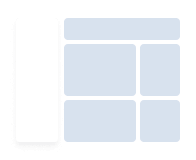
Navbar Vertical Card
Make your navbar vertical like Falcon card by using Navbar Vertical Card.
See the implementation hereHtml
Add .navbar-card class to .navbar-vertical element to set white background and card shadow to the .navbar-collapse element to convert Transparent Navbar Vertical to Card Navbar Vertical.
<nav class="navbar navbar-vertical navbar-expand-xl navbar-light navbar-card">

  <!-- Content-->
  <div class="collapse navbar-collapse">
    <div class="navbar-vertical-content scrollbar">

      <!-- Navbar content-->
    </div>
  </div>
</nav>
You can change background-color by adding .bg-* utility classes in .navbar-collapse element or you can update globally using the SCSS variable which is described in SCSS section below.
<div class="collapse navbar-collapse bg-white">
   <div class="navbar-vertical-content scrollbar">

     <!-- Navbar content  -->
   </div>
 </div>
Customize
Falcon allow you to customize your Navbar Vertical with SCSS or CSS variables. The available options are listed below:
Background color
To change the background color
of the
Navbar Vertical Card
, update the SCSS variable $navbar-vertical-card-bg-color in your _user-variables.scss or CSS variable --falcon-navbar-vertical-card-bg-color in your public/assets/css/user.css. Example:
//- _user-variables.scss
$navbar-vertical-card-bg-color: #ff0000;
or,
//- public/assets/css/user.css
--falcon-navbar-vertical-card-bg-color: #ff0000;
Link color
To change the link color
of the
Navbar Vertical Card
, update the SCSS variable $navbar-vertical-card-link-color in your _user-variables.scss or CSS variable --falcon-navbar-vertical-card-link-color in your public/assets/css/user.css. Example:
//- _user-variables.scss
$navbar-vertical-card-link-color: #ff0000;
or,
//- public/assets/css/user.css
--falcon-navbar-vertical-card-link-color: #ff0000;
Link hover color
To change the link hover color
of the
Navbar Vertical Card
, update the SCSS variable $navbar-vertical-card-link-hover-color in your _user-variables.scss or CSS variable --falcon-navbar-vertical-card-link-hover-color in your public/assets/css/user.css. Example:
//- _user-variables.scss
$navbar-vertical-card-link-hover-color: #ff0000;
or,
//- public/assets/css/user.css
--falcon-navbar-vertical-card-link-hover-color: #ff0000;
Link active color
To change the link active color
of the
Navbar Vertical Card
, update the SCSS variable $navbar-vertical-card-link-active-color in your _user-variables.scss or CSS variable --falcon-navbar-vertical-card-link-active-color in your public/assets/css/user.css. Example:
//- _user-variables.scss
$navbar-vertical-card-link-active-color: #ff0000;
or,
//- public/assets/css/user.css
--falcon-navbar-vertical-card-link-active-color: #ff0000;
Divider color
To change the divider color
of the
Navbar Vertical Card
, update the SCSS variable $navbar-vertical-card-hr-color in your _user-variables.scss or CSS variable --falcon-navbar-vertical-card-hr-color in your public/assets/css/user.css. Example:
//- _user-variables.scss
$navbar-vertical-card-hr-color: #ff0000;
or,
//- public/assets/css/user.css
--falcon-navbar-vertical-card-hr-color: #ff0000;
Scrollbar color
To change the scrollbar color
of the
Navbar Vertical Card
, update the SCSS variable $navbar-vertical-card-scrollbar-color in your _user-variables.scss or CSS variable --falcon-navbar-vertical-card-scrollbar-color in your public/assets/css/user.css. Example:
//- _user-variables.scss
$navbar-vertical-card-scrollbar-color: #ff0000;
or,
//- public/assets/css/user.css
--falcon-navbar-vertical-card-scrollbar-color: #ff0000;